Introduction

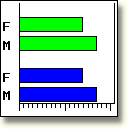
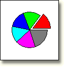
To create bar charts and pie charts that graphically display relationships within your data, you can use the GCHART procedure within SAS/GRAPH software. You can create charts to display

  • the distribution of a variable's values (example: sales per month)
  • the relationship between two or more variables (example: sales and expenditures for advertising)
  • the average value of a variable within different categories (example: average purchases by age group)
  • the total value of a variable within different categories (example: total purchases for each age group).

To view a larger version of a bar or pie chart, select an image.


Bar Chart          
Display enlarged bar chart.          

Pie Chart
     Display enlarged pie chart.

This lesson shows you how to create basic horizontal bar charts, vertical bar charts, and pie charts. You also learn to specify data and statistics and to control the pattern and color in charts.

Caution This lesson is not suitable for use with SAS Enterprise Guide.


1 hour


In this lesson, you learn how to

  • invoke the GCHART procedure and specify which data set to use
  • specify the type of chart to be created
  • specify the statistic to be displayed
  • summarize a variable within categories
  • specify variables to be displayed
  • select observations
  • control the pattern and color of bars and slices
  • use RUN-group processing
  • view and store charts.

complete the following lessons:

  • .